Seeing Through It
Why transparent tech is making a comeback.
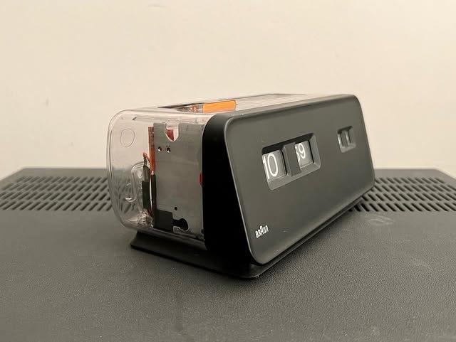
Early Braun prototypes were sometimes made with clear parts in order for the company to ensure the quality of the product met its rigorous standards. It also made it much easier for engineers to examine and explain the inner workings to various teams. But in the spirit of “less is more,” often when the object went into production, it was made out of opaque plastic, keeping the ingenious design relatively safe from prying eyes.
But towards the end of the 1980s, a healthy distrust was developing between the common populace and the rapid advancement of technology in daily life. Computers were just getting personal. Car phones were a luxury few could afford, let along early, bulky cellular phones that could only do one thing: send and receive calls.
Over time, transparency in technology became a bit of a trend in itself—resulting in see-through music players, pagers, and even telephones. The Conair Phone amped up the decade’s trends by inserting neon parts inside its clear shell. Transparency wasn’t just about making something look futuristic—but clearly demonstrating to apprehensive consumers that technology had nothing to hide, and therefore, was something to be embraced, not feared.
In 1995, Nintendo first released the transparent Game Boy as part of its “Play It Loud” series, rendering the handheld console in wild colors and new iterations. The idea stuck around in gaming, with clear versions of the Game Boy Pocket and Game Boy Advance releasing later down the line. Even other companies like Microsoft and Sony would take cues from the trend all the way into the 2000s, creating various colors of clear plastic consoles and controllers.
But perhaps the case for crystal clear design is remembered with Jony Ive’s 1998 iMac. Launching in a series of covetable colors, and with a Jeff Goldblum-narrated campaign that was pretty much the “Who Shot Ya?” that ignited Apple’s longtime beef with PCs in general, it managed to do the impossible: get consumers to think a computer was cool.
Further immortalized in films like Zoolander, the late Steve Jobs even praised the design, saying: “It looks like it's from another planet, a planet with better designers... The back of this thing looks better than the front of other guys' systems.”
Indeed, in a world of primarily gray plastic boxes and a bevy of confusing wires, Ive applied Dieter Rams’ “less is more” philosophy to the personal computer, effectively turning it into a vehicle for personal style, and setting the stage for Apple to become as much of a fashion brand as it is a tech company.
That brings us to the current state of Apple, which is on the verge of releasing a familiarly clear software design known as Liquid Glass. It comes during a time when people are once again apprehensive about where technology has taken us—AI has encroached on multiple forms on creativity, with the jury still out on whether it will hinder or help culture. Misinformation campaigns run rampant, influencing everything from politics to science.
Meanwhile, a growing movement of people who are blissfully offline is seeing people adopt apps like Brick or ditching smartphones for the Light Phone, willfully tuning out all the noise that is readily at our fingertips. Perhaps the timely introduction of the quaint, nostalgic aesthetic is back to remind us that tech at its core remains neutral, despite its intentions becoming less clear by the day.


“tech at its core remains neutral” i suspect in a few years this might change
This is peak
90’s design